

Your Cart
The cart is empty

Last Updated: 9 September 2026
When was the last time you thought about a toilet sign? If you are like most people, you probably only notice them when something goes wrong. A confusing symbol, a faded plaque, or a sign that is just not where you expect it to be. At that moment, a simple act of navigation becomes a moment of stress.
But a well-designed toilet sign does more than just point the way. It creates a seamless, intuitive experience. It builds trust. It reinforces a brand's commitment to quality and attention to detail.
This article explores the psychology behind effective toilet sign design, revealing how small details can have a big impact on user experience, brand perception, and even safety.
Essential Commercial Project Documentation:
In any commercial space, the visitor's journey is a series of small interactions. A well-designed toilet sign is one of those interactions that, when done right, goes completely unnoticed.
When a visitor can find the restroom without hesitation, they feel more comfortable and confident in the space. They are free to focus on the purpose of their visit, whether it is shopping, dining, or attending a meeting.
But when a toilet sign is confusing or poorly placed, the opposite happens. A moment of doubt can quickly turn into frustration, and that frustration can taint the entire experience. As one expert noted, "A handful of complaining guests who missed an important speaker due to obscure arrows and infrequent prompts can quickly taint an experience."
The goal of effective toilet sign design is to eliminate that frustration entirely.
Colour is one of the most powerful tools in a designer's toolkit. It can evoke emotions, guide attention, and communicate meaning without a single word.
For individuals with low vision, visual contrast is the primary navigation aid. High-contrast colour combinations, such as matte black symbols on a brushed aluminium background, are essential for legibility. SANS 10400-S regulations specify that signs must have high contrast between the symbol/lettering and the background.
In large, complex facilities, colour can be used to create a subconscious wayfinding system. For example, a consistent colour palette on all toilet signs, such as blue for men and pink for women, helps visitors quickly locate the correct facility.
The colours you choose for your toilet signs are also a reflection of your brand. A sophisticated colour palette, like matte black or brushed aluminium, communicates professionalism and quality. A playful palette might suit a creative agency or children's facility.
Imagine walking into a building where every sign looks different. Some are bold, others are subtle. Some use modern symbols, others use outdated ones. This inconsistency creates confusion and erodes trust.
According to established wayfinding principles, "visual continuity and order in signage helps visitors build a mental map of your property, reducing confusion and improving the overall experience." Consistent use of typography, colour schemes, and symbol styles allows visitors to subconsciously identify wayfinding markers as they move through a complex facility.
When a visitor sees a consistent style across a building's signage, they subconsciously build a mental map of the space. This consistency signals that a building is well-managed and that every detail has been considered.
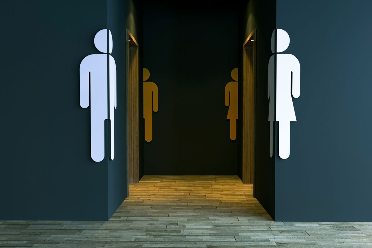
Humans process visual information much faster than text. A well-designed symbol can be understood in a fraction of a second, while reading a word takes longer.
The most effective approach is a combination of symbols and text, where the symbol provides instant recognition, and the text provides confirmation.
One of the most important principles of wayfinding design is reducing the number of decision points a visitor faces. The more choices a visitor must make, the higher the cognitive load and the greater the chance of confusion.
Professional wayfinding systems strategically place toilet signs at "decision points"—locations where visitors naturally hesitate—while eliminating unnecessary signage that could create clutter. As one signage expert notes, "Only ever give your guests two things to do on arrival."
In the context of toilet signs, this means:
A truly effective toilet sign is one that works for everyone, regardless of their physical abilities or cultural background. Inclusive design is not just a legal requirement, it is a reflection of your brand's values.
A business that invests in high-quality, well-designed toilet signs signals that it cares about the details. This attention to detail builds trust and confidence in the brand.
What is the most important factor in designing an effective toilet sign?
The most important factor is clarity. A toilet sign must be instantly understandable to all users. This means using high-contrast colours, clear symbols, and consistent design.
Why is consistency important in toilet sign design?
Consistency helps visitors build a mental map of a space. When all toilet signs share a common visual language, visitors can subconsciously identify them, reducing confusion.
How do toilet signs impact brand perception?
High-quality, well-designed toilet signs signal professionalism and attention to detail. This builds trust and reinforces a positive brand image.
What are the most common mistakes in toilet sign design?
Common mistakes include confusing symbols, poor placement, low contrast, and inconsistent design.
Do toilet signs need to be accessible for people with disabilities?
Yes. In South Africa, SANS 10400-S regulations require toilet signs to meet specific accessibility standards, including high contrast and tactile/Braille features for permanent room identification.
Our premium toilet signs are designed with psychology and usability in mind. Manufactured from heavy-duty Aluminium Composite Material (ACM), they combine durability with a sophisticated aesthetic. Available in a range of finishes and design styles to match any commercial space.
Browse our full collection of premium toilet signs and find the perfect signs for your project.